 |
The following page (Cartography) has Reference Numbers. Please take off all reference numbers an example would be [7] [33] and others like these. Thank you. |
Cartography (in Greek chartis = map and graphein = write) is the study and practice of making geographical maps. Combining science, aesthetics, and technique, cartography builds on the premise that reality can be modeled in ways that communicate spatial information effectively.
The fundamental problems of cartography are to:
- Set the map's agenda and select traits of the object to be mapped. This is the concern of map editing. Traits may be physical, such as roads or land masses, or may be abstract, such as toponyms or political boundaries.
- Represent the terrain of the mapped object on flat media. This is the concern of map projections.
- Eliminate characteristics of the mapped object that are not relevant to the map's purpose. This is the concern of generalization.
- Reduce the complexity of the characteristics that will be mapped. This is also the concern of generalization.
- Orchestrate the elements of the map to best convey its message to its audience. This is the concern of map design.

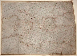
The oldest original cartographic artifact in the Library of Congress: a nautical chart of the Mediterranean Sea. Second quarter of the fourteenth century.
History[]
Copy (1475) of St. Isidore's TO map of the world.The earliest known map is a matter of some debate, both because the definition of "map" is not sharp and because some artifacts speculated to be maps might actually be something else. A wall painting, which may depict the ancient Anatolian city of Çatalhöyük (previously known as Catal Huyuk or Çatal Hüyük), has been dated to the late 7th millennium BCE.[1][2] Other known maps of the ancient world include the Minoan “House of the Admiral” wall painting from c. 1600 BCE, showing a seaside community in an oblique perspective and an engraved map of the holy Babylonian city of Nippur, from the Kassite period (14th – 12th centuries BCE).[3]
The ancient Greeks and Romans created maps, beginning at latest with Anaximander in the 6th century BC.[4] In the 2nd century AD, Ptolemy produced his treatise on cartography, Geographia. [5] This contained Ptolemy's world map - the world then known to Western society (Ecumene). As early as the 700s, Arab scholars were translating the works of the Greek geographers into Arabic.[6]
In ancient China, geographical literature spans back to the 5th century BC. The oldest extant Chinese maps come from the State of Qin, dated back to the 4th century BC, during the Warring States Period. In the book of the Xin Yi Xiang Fa Yao, published in 1092 by the Chinese scientist Su Song, a star map on the equidistant cylindrical projection.[7][8] Although this method of charting seems to have existed in China even prior to this publication and scientist, the greatest significance of the star maps by Su Song, is that they represent the oldest existent star maps in printed form.
Early forms of cartography of India included legendary paintings; maps of locations described in Indian epic poetry, for example, the Ramayana.[9] Indian cartographic traditions also covered the locations of the Pole star, and other constellations of use.[10] These charts may have been in use by the beginning of the Common Era for purposes of navigation.
Mappa mundi is the general term used to describe Medieval European maps of the world. Approximately 1,100 mappae mundi are known to have survived from the Middle Ages. Of these, some 900 are found illustrating manuscripts and the remainder exist as stand-alone documents (Woodward, p. 286).
The Tabula Rogeriana, drawn by Muhammad al-Idrisi for Roger II of Sicily in 1154.The Arab geographer, Muhammad al-Idrisi, produced his medieval atlas Tabula Rogeriana in 1154. He incorporated the knowledge of Africa, the Indian Ocean and the Far East, gathered by Arab merchants and explorers with the information inherited from the classical geographers to create the most accurate map of the world up until his time. It remained the most accurate world map for the next three centuries.[11]
In the Age of Exploration, from the 15th century to the 17th century, European cartographers both copied earlier maps (some of which had been passed down for centuries) and drew their own based on explorers' observations and new surveying techniques. The invention of the magnetic compass, telescope and sextant enabled increasing accuracy. In 1492, Martin Behaim, a German cartographer, made the oldest extant globe of the Earth.[12]
Johannes Werner refined and promoted the Werner map projection. In 1507, Martin Waldseemüller produced a globular world map and a large 12-panel world wall map (Universalis Cosmographia) bearing the first use of the name "America". Portuguese cartographer, Diego Ribero, was author of the first known planisphere with a graduated Equator (1527). Italian cartogapher Battista Agnese produced at least 71 manuscript atlases of sea charts.
Due to the sheer physical difficulties inherent in cartography, map-makers frequently lifted material from earlier works without giving credit to the original cartographer. For example, one of the most famous early maps of North America is unofficially known as the "Beaver Map", published in 1715 by Herman Moll. This map is an exact reproduction of a 1698 work by Nicolas de Fer. De Fer in turn had copied images that were first printed in books by Louis Hennepin, published in 1697, and François Du Creux, in 1664. By the 1700s, map-makers started to give credit to the original engraver by printing the phrase "After [the original cartographer]" on the work.[13]
Technological changes[]
A pre-Mercator nautical chart of 1571, from Portuguese cartographer Fernão Vaz Dourado (c. 1520-c.1580). It belongs to the so-called plane chart model, where observed latitudes and magnetic directions are plotted directly into the plane, with a constant scale, as if the Earth were plane (Portuguese National Archives of Torre do Tombo, Lisbon).In cartography, technology has continually changed in order to meet the demands of new generations of mapmakers and map users. The first maps were manually constructed with brushes and parchment; therefore, varied in quality and were limited in distribution. The advent of magnetic devices, such as the compass and much later, magnetic storage devices, allowed for the creation of far more accurate maps and the ability to store and manipulate them digitally.
Advances in mechanical devices such as the printing press, quadrant and vernier, allowed for the mass production of maps and the ability to make accurate reproductions from more accurate data. Optical technology, such as the telescope, sextant and other devices that use telescopes, allowed for accurate surveying of land and the ability of mapmakers and navigators to find their latitude by measuring angles to the North Star at night or the sun at noon.
Advances in photochemical technology, such as the lithographic and photochemical processes, have allowed for the creation of maps that have fine details, do not distort in shape and resist moisture and wear. This also eliminated the need for engraving, which further shortened the time it takes to make and reproduce maps.
Advances in electronic technology in the 20th century ushered in another revolution in cartography. Ready availability of computers and peripherals such as monitors, plotters, printers, scanners (remote and document) and analytic stereo plotters, along with computer programs for visualization, image processing, spatial analysis, and database management, have democratized and greatly expanded the making of maps. The ability to superimpose spatially located variables onto existing maps created new uses for maps and new industries to explore and exploit these potentials. See also: digital raster graphic.
These days most commercial-quality maps are made using software that falls into one of three main types: CAD, GIS and specialized illustration software. Spatial information can be stored in a database, from which it can be extracted on demand. These tools lead to increasingly dynamic, interactive maps that can be manipulated digitally.
Map types[]
General vs thematic cartography[]
Topographic map of Easter Island.In understanding basic maps, the field of cartography can be divided into two general categories: general cartography and thematic cartography. General cartography involves those maps that are constructed for a general audience and thus contain a variety of features. General maps exhibit many reference and location systems and often are produced in a series. For example, the 1:24,000 scale topographic maps of the United States Geological Survey (USGS) are a standard as compared to the 1:50,000 scale Canadian maps. The government of the UK produces the classic 1:63,360 (1 inch to 1 mile) "Ordnance Survey" maps of the entire UK and with a range of correlated larger- and smaller-scale maps of great detail.
Thematic cartography involves maps of specific geographic themes, oriented toward specific audiences. A couple of examples might be a dot map showing corn production in Indiana or a shaded area map of Ohio counties, divided into numerical choropleth classes. As the volume of geographic data has exploded over the last century, thematic cartography has become increasingly useful and necessary to interpret spatial, cultural and social data.
An orienteering map combines both general and thematic cartography, designed for a very specific user community. The most prominent thematic element is shading, that indicates degrees of difficulty of travel due to vegetation. The vegetation itself is not identified, merely classified by the difficulty ("fight") that it presents.
[edit] Topographic vs topological
A topographic map is primarily concerned with the topographic description of a place, including (especially in the 20th century) the use of contour lines showing elevation. Terrain or relief can be shown in a variety of ways (see Cartographic relief depiction).
A topological map is a very general type of map, the kind you might sketch on a napkin. It often disregards scale and detail in the interest of clarity of communicating specific route or relational information. Beck's London Underground map is an iconic example. Though the most widely used map of "The Tube," it preserves little of reality. It varies scale constantly and abruptly, it straightens curved tracks, and it contorts directions haphazardly. The only traits the map preserves are the order of the stations and crossings along the tracks and whether a station or crossing is north or south of the River Thames. Yet those are all a typical passenger wishes to know, so the map fulfills its purpose.[14]
Map design[]
Illustrated map.Arthur H. Robinson, an American cartographer influential in thematic cartography, stated that a map not properly designed "will be a cartographic failure." He also claimed, when considering all aspects of cartography, that "map design is perhaps the most complex."[15] Robinson codified the mapmaker's understanding that a map must be designed foremost with consideration to the audience and its needs.
From the very beginning of mapmaking, maps "have been made for some particular purpose or set of purposes".[16] The intent of the map should be illustrated in a manner in which the percipient acknowledges its purpose in a timely fashion. The term percipient refers to the person receiving information and was coined by Robinson.[17] The principle of figure-ground refers to this notion of engaging the user by presenting a clear presentation, leaving no confusion concerning the purpose of the map. This will enhance the user’s experience and keep his attention. If the user is unable to identify what is being demonstrated in a reasonable fashion, the map may be regarded as useless.
Making a meaningful map is the ultimate goal. Alan MacEachren explains that a well designed map "is convincing because it implies authenticity" (1994, pp. 9). An interesting map will no doubt engage a reader. Information richness or a map that is multivariate shows relationships within the map. Showing several variables allows comparison, which adds to the meaningfulness of the map. This also generates hypothesis and stimulates ideas and perhaps further research. In order to convey the message of the map, the creator must design it in a manner which will aid the reader in the overall understanding of its purpose. The title of a map may provide the "needed link" necessary for communicating that message, but the overall design of the map fosters the manner in which the reader interprets it (Monmonier, 1993, pp. 93).
In the 21st century it is possible to find a map of virtually anything from the inner workings of the human body to the virtual worlds of cyberspace. Therefore there are now a huge variety of different styles and types of map - for example, one area which has evolved a specific and recognisable variation are those used by public transport organisations to guide passengers, namely urban rail and metro maps, many of which are loosely based on 45 degree angles as originally perfected by Harry Beck and George Dow.

modern illistrated map
Naming conventions[]
Most maps use text to label places and for such things as a map title, legend and other information. Maps are often made in specific languages, though names of places often differ between languages. So a map made in English may use the name Germany for that country, while a German map would use Deutschland and a French map Allemagne. A word that describes a place, using a non-native terminology or language is referred to as an exonym.
In some cases the proper name is not clear. For example, the nation of Burma officially changed its name to Myanmar, but many nations do not recognize the ruling junta and continue to use Burma. Sometimes an official name change is resisted in other languages and the older name may remain in common use. Examples include the use of Saigon for Ho Chi Minh City, Bangkok for Krung Thep and Ivory Coast for Côte d'Ivoire.
Difficulties arise, when transliteration or transcription between writing systems is required. National names tend to have well established names in other languages and writing systems, such as Russia for Росси́я, but for many placenames a system of transliteration or transcription is required. In transliteration, the symbols of one language are represented by symbols in another. For example, the Cyrillic letter Р is traditionally written as R in the Latin alphabet. Systems exist for transliteration of Arabic, but the results may vary. For example, the Yemeni city of Mocha is written variously in English as Mocha, Al Mukha, al-Mukhā, Mocca and Moka. Transliteration systems are based on relating written symbols to one another, while transcription is the attempt to spell in one language the phonetic sounds of another. Chinese writing is transformed into the Latin alphabet through the Pinyin phonetic transcription systems. Other systems were used in the past, such as Wade-Giles, resulting in the city being spelled Beijing on newer English maps and Peking on older ones.
Further difficulties arise when countries, especially former colonies, do not have a strong national geographic naming standard. In such cases, cartographers may have to choose between various phonetic spellings of local names versus older imposed, sometimes resented, colonial names. Some countries have multiple official languages, resulting in multiple official placenames. For example, the capital of Belgium is both Brussels and Bruxelles. In Canada, English and French are official languages and places have names in both languages. British Columbia is also officially named la Colombie-Britannique. English maps rarely show the French names outside of Quebec, which itself is spelled Québec in French.[18]
The study of placenames is called toponymy, while that of the origin and historical usage of placenames as words is etymology.
Map symbology[]
The quality of a map’s design affects its reader’s ability to extract information and to learn from the map. Cartographic symbology has been developed in an effort to portray the world accurately and effectively convey information to the map reader. A legend explains the pictorial language of the map, known as its symbology. The title indicates the region the map portrays; the map image portrays the region and so on. Although every map element serves some purpose, convention only dictates inclusion of some elements, while others are considered optional. A menu of map elements includes the neatline (border), compass rose or north arrow, overview map, scale bar, projection and information about the map sources, accuracy and publication.
When examining a landscape, scale can be intuited from trees, houses and cars. Not so with a map. Even such a simple thing as a north arrow is crucial. It may seem obvious that the top of a map should point north, but this might not be the case.
Color, likewise, is equally important. How the cartographer displays the data in different hues can greatly affect the understanding or feel of the map. Different intensities of hue portray different objectives the cartographer is attempting to get across to the audience. Today, personal computers can display up to 16 million distinct colors at a time, even though the human eye can distinguish only a minimum number of these (Jeer, 1997). This fact allows for a multitude of color options for even for the most demanding maps. Moreover, computers can easily hatch patterns in colors to give even more options. This is very beneficial, when symbolizing data in categories such as quintile and equal interval classifications.
Quantitative symbols give a visual measure of the relative size/importance/number that a symbol represents and to symbolize this data on a map, there are two major classes of symbols used for portraying quantitative properties. Proportional symbols change their visual weight according to a quantitative property. These are appropriate for extensive statistics. Choropleth maps portray data collection areas, such as counties or census tracts, with color. Using color this way, the darkness and intensity (or value) of the color is evaluated by the eye as a measure of intensity or concentration (Harvard Graduate School of Design, 2005).
Map generalization[]
A good map has to provide a compromise between portraying the items of interest (or themes) in the right place for the map scale used, against the need to annotate that item with text or a symbol, which takes up space on the map medium and very likely will cause some other item of interest to be displaced. The cartographer is thus constantly making judgements about what to include, what to leave out and what to show in a slightly incorrect place - because of the demands of the annotation. This issue assumes more importance as the scale of the map gets smaller (i.e the map shows a larger area), because relatively, the annotation on the map takes up more space on the ground. A good example from the late 1980s was the Ordnance Survey's first digital maps, where the absolute positions of major roads shown at scales of 1:1250 and 1:2500 were sometimes a scale distance of hundreds of metres away from ground truth, when shown on digital maps at scales of 1:250000 and 1:625000, because of the overriding need to annotate the features.